

Building Better Communication for MTA Employees
This is a theoretical team project, conceptualizing an app for the MTA of NYC.
Figma, Miro, Otter, Zoom
TOOLS:
4 Weeks
TIMEFRAME:
Design Thinking
KEY METHOD
Prototype, Research, Branding
DELIVERABLES:

Welcome to my MTALK Portfolio!
As a Project Manager and a UX Designer, I was privileged to lead and contribute to the development of MTALK, an all-in-one communication app designed to meet the communication needs of MTA employees. Our team utilized design thinking, UX methodologies, and user research to develop an effective solutions.
My role was to oversee the entire design process, from research and ideation to prototyping and testing. Specifically, I worked with the team to define project goals, conduct user research, develop user personas, create wireframes and prototypes, and conduct usability testing to ensure the final product met user needs and expectations. I also collaborated with the UI designer to ensure the visual design of the app aligned with the project goals and user feedback. Throughout the project, I communicated regularly with team members to keep everyone informed and engaged. Ultimately, my goal was to ensure that the app was easy to use, intuitive, and provided a seamless communication experience for MTA employees.
MEET THE TEAM:

INTRODUCTION
The Metropolitan Transportation Authority has communication between its six agencies.
Transportation industries rely on effective communication for their employees. It's current software is dated, slow, and is temperamental. The results are negative impacts and delays for customers. Modernize it's software for better communications, the MTA wants will empower employees to stay connected and keep the city that never sleeps running smoothly.
MTALK is an all-in-one communication app designed for MTA employees.
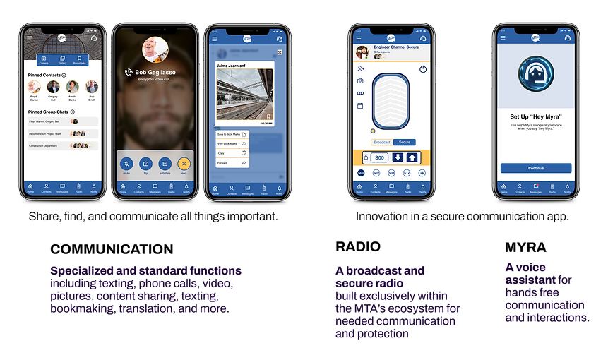
A solution that simplifies communication through design thinking, UX methodologies, and user research. The app offers a variety of features that meet the communication needs of the MTA workforce, such as automated voice commands, translations, subtitles, and enlarged font options for employees underground. The app has secure access options with face recognition, multiple forms of communication, and hands-free capabilities. It keeps employees connected through searching directories, saving contacts, and building groups with accessibility features. Valued content may be bookmarked and effortlessly shared, and video communication enables clearer and personal communications.
CHALLENGE
Our project was to address communication issues faced by MTA employees. However, we soon realized that this would be difficult due to FMCSA regulations that prohibit the use of handheld digital devices by transit employees while operating a vehicle.
To overcome this obstacle, we focused on creating an MVP that could be used by employees in non-driving roles, allowing for future iterations as regulations evolve.
Our solution aimed to provide a digital experience that all employees could utilize, while staying within the confines of existing regulations. As UX designers, we were determined to create a product that not only met the needs of employees but also complied with regulations and could be expanded to serve employees across all departments. By keeping this in mind, we were able to create a prototype that addressed the communication issues faced by MTA employees while also complying with FMCSA regulations.
Persona and Design Thinking
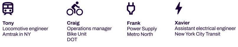
To create a solution that meets the communication needs of MTA employees, our team interviewed and gathered insights from four individuals with different transit professions. We used the information gathered to draft our personas and build needed objectives. By utilizing design thinking, we collaborated to identify pain points and needs and develop MTALK.
I collaborated with the Research Leads to conduct user interviews. During our first interview, we connected with an engineer in the transit industry who helped us gain valuable communication insights, reveal needs, and identify potential challenges. With this knowledge, we structured questions to interview three other individuals from different departments in the MTA.
Participants: 4
Gender: Males
Age: 33-50
I'm having a hard time getting a response via email. That's usually why I would use my phone or it's easier to convey information verbally.
“I'll text the photos usually when it's someone in my group, but whenever it's someone else in a different group, probably send an email so we can send it to different people in multiple groups.”
Personas template I designed with the Interaction Leads Linda who made the final iteration
Hank needs secure access to different modes of communication so that he can complete his field tasks efficiently and respond to communications from coworkers in a timely manner. As a primary Spanish speaker, sometimes he needs translation assistance.

Point-of-View and How-Might-We statements to help us focus on the need and potential solutions.
Hanks needs one app that ties all his work communication devices together.
How might we help Hank communicate more efficently and with less devices?
POV
HMW
UX Methodologies and Insights
Through user surveys and brainstorming sessions, we used methodologies to uncover insights and define requirements for MTALK. With so many departments and functions in the MTA, we explored the idea of an all-in-one app with the capabilities to easily share items along with hands-free features. The ideate process was used to come up with multiple potential solutions before settling on a final design.
User surveys
We conducted user surveys to gain insights into communication trends in other industries, which helped to reveal alternative options. I helped to formulate survey questions and solicited individuals to participate in various industries, such as banking, medical, education, transportation, and start-ups. Through this research, we found that people used multiple devices, which made it essential for us to design a digital experience that could be accessed from different devices. We also analyzed software capabilities used by individuals and incorporated them into our design.

Collaboration and brainstorming
Sessions were dynamic and fueled by lively discussions on direction. I facilitated the process by asking questions and clarifying assumptions. Despite the challenges, we navigated through them with impressive agility. To manage our resources effectively, I created a database sheet that was utilized for tracking progress, team meetings, and easy access to related items. The sheet was particularly beneficial during our brainstorming sessions. We used a voting system to determine the Minimum Viable Project (MVP) and to place features and elements on the designs.
Affinity Mapping
I organized Affinity Mapping for the Research Leads to present their initial findings, highlighting user communication needs and pain points. With active listening and questioning, I provided suggestions as we defined what should be included in the prototype.


Competitive and Comparative Analysis
To determine what functions similar companies use and what should be included in our design solutions, our team researched different companies using competitive and comparative analysis. Our research revealed that other companies had similar features, though it was not an all-in-one app. We used the ideate process to come up with unique and innovative features that would set MTALK apart from the competition.
I explored Google's capabilities and found it not to be a direct competitor to our product. After discovering Zello through research, we integrated walkie-talkie capabilities into our product, leveraging transit's internal structures, digital ecosystem, and secure systems. I identified the desired features and capabilities for the product and pursued multiple communication options with collaborative functions.

User Research and Impact
Conducting 22 user surveys from comparative industries, we identified important communication elements and what devices are predominantly used. The information gathered from the surveys was used in our brainstorming and infinity mapping sessions, which framed our MVP. Our objective was to include BYODs (Bring Your Own Device) security to reduce equipment costs. Personal cell phones are universally used across various users which would also help adaptability with a broader range of users. By conducting user research and ideating potential solutions, we developed MTALK to meet the needs of MTA employees. MTALK's design enables BYODs, reducing equipment costs, and making the app accessible to a broader range of users.
USER FLOWS
We assigned project initiatives where each of us took the lead on developing a key feature of the prototype. I was tasked with the "radio, walkie-talkie, communication" feature. In Miro, during brainstorming sessions, presented the user flow on accessing the feature and capabilities along with exiting.

Design Impact and Solution
Our team's design impact was to develop an all-in-one app that meets the communication needs of MTA employees. MTALK offers unique features like automated voice commands, translations, and subtitles for employees underground. Our solution is an all-in-one communication app that meets the needs of MTA employees. MTALK's design enables easy communication, reduces response times, and keeps employees connected through searching directories, saving contacts and building groups with accessibility features. Valued content may be bookmarked and effortlessly shared. Video communication to see who is talking for clearer and personal communications. Non-primary English speakers aid in translating communications. Hands-free capabilities make it an excellent solution for MTA employees.
The moodboard I created for branding decisions, preferring the 1970's design with black and rainbow colors. However, the team chose a simpler approach with blue and yellow colors used in "Metro Card" and "MY mta".

DESIGN SYSTEM
Our team chose the name "MTALK" as a combination of MTA and talk communication. The Interaction Leads developed a design system to maintain consistent branding from wireframes to high fidelity prototypes. I provided Figma training and guidance on creating interactive components, researched specific functionalities, and ensured everyone was progressing with their learning. I also offered troubleshooting support and helped meet deadlines as needed.

MY DESIGN PROTOTYPE EVOLUTION
Here are my sketched and prototype iterations of the radio communication feature created in Figma. Presenting designs to the team we reviewed it for easy follow functionality along with ADA compliance. With first iterations it was determined design components sizing and color was an issue as it didn't meet the ADA standards. Each of us had similar challenges with the designated key features due to the limited color palette. As a team we resolved issues meeting the deadline for the final prototype.

FEATURES:
-
Secure cell phone calls.
-
Secure face recognition access
-
Multiple forms of communications.
-
Internal search of employee directories
-
Saving contacts
-
Building groups with accessibility features.
-
Secure bookmark and share content
-
Video communication
-
Photo
-
Messaging
-
Group chat
-
Language translating
-
Subtitles and enlarged font options
-
Myra, voice assistance
-
Hands-free capabilities
-
Radio; broadcast and secure channels
KEY FEATURES
I led the team in gaining empathy and identifying communication needs for MTA employees, resulting in multiple collaboration options. I designed and made the "radio" feature ADA compliant and it was found to be both fun and easy to understand during testing. I also assisted the Interaction Leads with component functionality and added animation to MYRA's design.
USABILITY TESTING
From the insights gained from prototype testing we made beneficial updates to MYRA and the translation features.
Pros:
Enjoyed the Radio found it playful.
Thought that MTALK was easy to use.
Found capabilities intuitive.
Understood MYRA was like a Siri / Google voice assistant / Microsoft paperclip.
Cons:
Had challenges with MYRA
-
Finding icon on the top right.
-
At times unclear if "enable Myra" was turning on Myra or setting up Myra.
-
In settings, when given directives to turn Myra off, was unsure to use the toggle or icon on top right corner.
-
Noticed delay on the home page. One user thought it was an ad.
-
Treated it as a clickable button vs sliding slide to side.
Translate button unclear; didn’t recognize it as a button, thought it was part of the conversation thread.
Reflections and Future Iterations
After completing the MTALK project, I reflected on our experience and identified areas for improvement. ADA compliance was a main issue as some users had difficulty seeing certain colors in our design. Rebranding with a 1970s aesthetic could be a solution.
To improve our product, we would prioritize adding maps, secure location sharing, and do not disturb capabilities with safety measures. An iPad/tablet version, internal documents archive system, and project management capabilities would also be valuable additions. We recognize the need for further input from user interviews to redesign the radio and Myra components for full ADA compliance.
This project taught me the importance of every voice being heard and valued. We discussed the importance of engaging with one another for support. While we focused on a viable MVP, documenting additional capabilities for future iterations is crucial to build a profitable product.